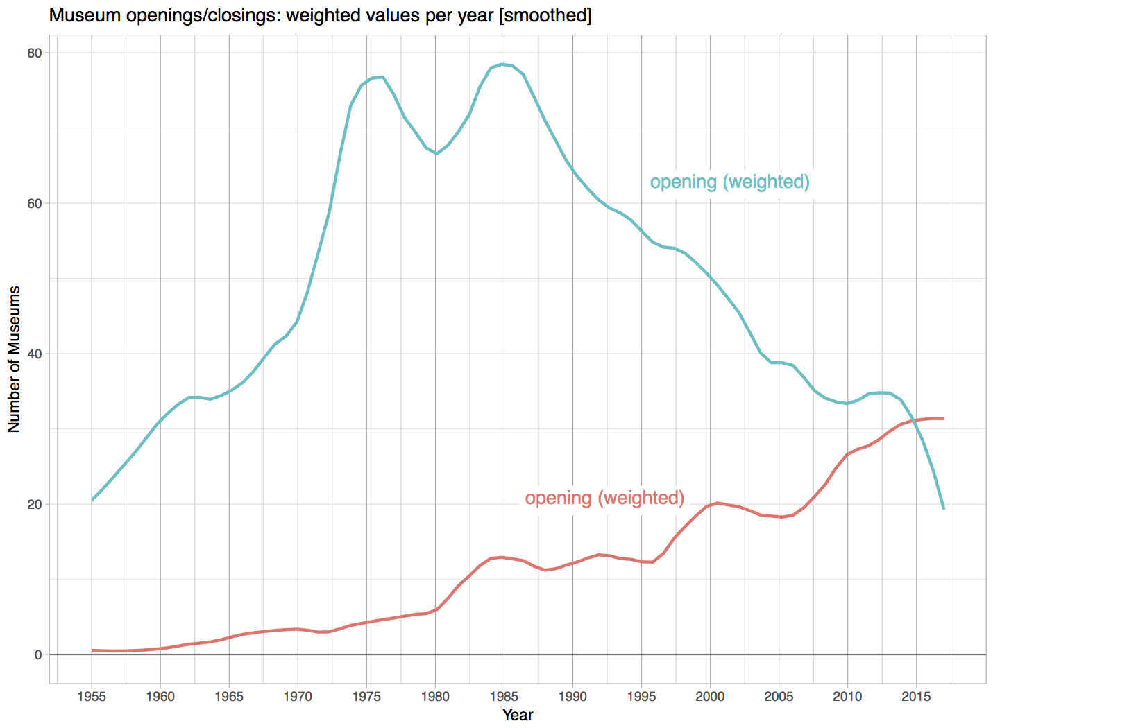
Figure 3: Plot showing museum openings and closings in the UK, 1960-2017 Figure 3: Plot showing museum openings and closings in the UK, 1960-2017 Post author By ubmjay001 Post date 26th February 2018 No Comments on Figure 3: Plot showing museum openings and closings in the UK, 1960-2017 Leave a Reply Cancel replyYour email address will not be published. Required fields are marked *Comment * Name * Email * Website Save my name, email, and website in this browser for the next time I comment. Δ