We are currently developing visualisations of our data on the whereabouts of collections from closed museums. This is proving complex because graphs, figures, or flow diagrams are never just a simple representation of information. And that problem is compounded when the data itself is patchy and sometimes imprecise. In this post we want to discuss some of the choices we made about modelling that information.
To recap, around 525 museums in the UK have closed since 2000 and we have been investigating what happened to their collections. That information has been entered onto a spreadsheet with almost two thousand lines of information. It is nearly impossible to get a grasp on the data by simply reading it through, so we create visualisations to capture and summarise different aspects of that information. We want to better understand where objects moved from and where they have gone; the issue was how best to visually represent that information.
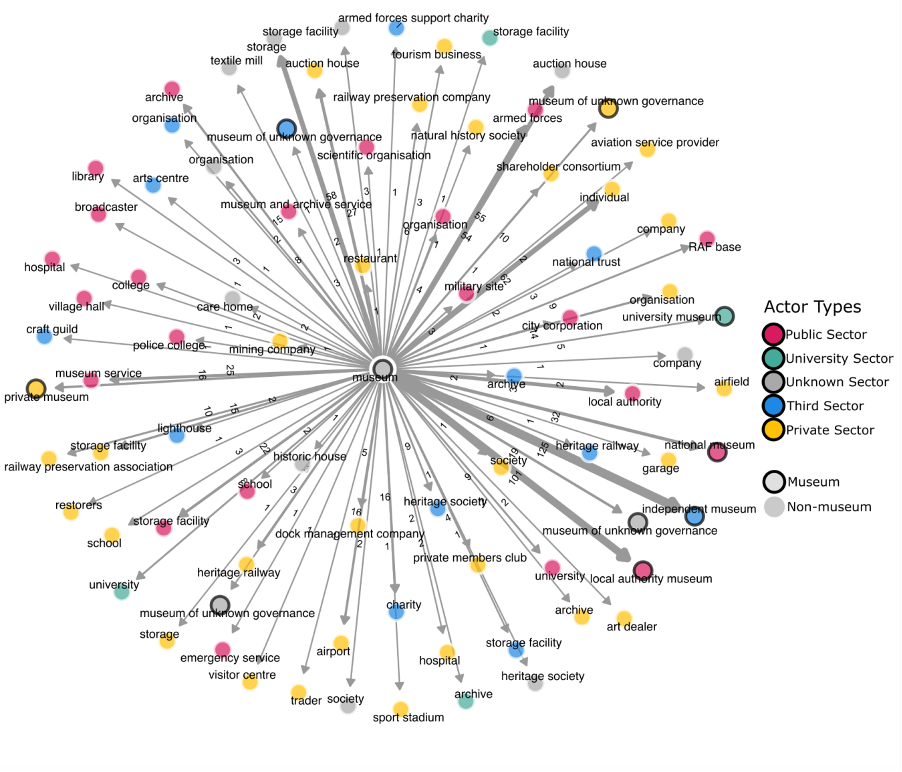
The first figure we used is known as a dendrogram (dendron means ‘tree’). The circle in the middle stands for all closed museums and the others stand for the recipients. This gave us a quick and striking indication of the sheer variety of destinations – objects moved from museums to heritage organisations, railway preservation societies, schools, mining companies, private individuals, and even airports. It was colour coded to help us differentiate between different kinds of entities: those in the public or private spheres, the third sector, and universities (which are not a neat fit with the others). We also labelled the lines or ‘edges’ with the number of transactions made, so we can see that there were sixteen transactions from closed museums to dock management companies and twenty-seven to auction houses and the lines are thicker where there were more transactions. (Please note that the data collection is not yet finished so the numbers are not yet final. Our focus here is on modelling, not the data contained within the visualisations).
This dendrogram was very general, so we filtered the data by museum characteristics, including governance, museum size, and subject matter. Figures 2 and 3 show the distribution of objects from closed local authority and independent museums, respectively. These figures also showed instances where objects had made more than one ‘jump’, for example moving from a closed museum a local authority and thence to a library or historic house.
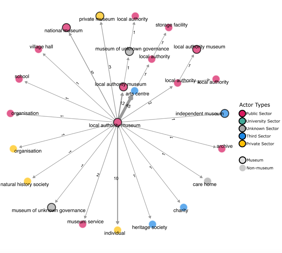
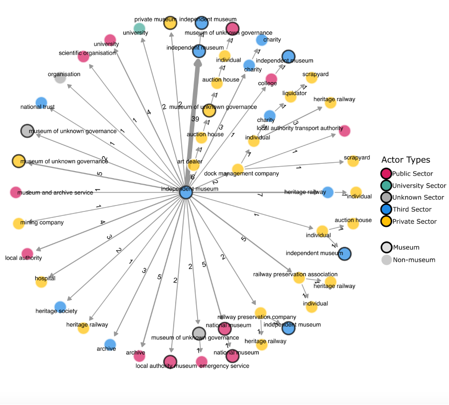
These figures were useful because they showed the differences in the patterns of closure according to governance. We could quickly see that objects from independent museums went to a much wider range of destinations than those from local authority museums. However, we wanted to be able to make more direct comparisons: to see the museums of different types and their destinations alongside each other.
Our next step was to create alluvial diagrams, which are used to show flow and change over time. In Figure 4 the bar on the left represents the different types of closed museums, the columns on the right represent recipients, and the ribbons between them indicate the flow of objects from one to the other. The lines are coloured by source, and the actors are grouped by governance and economic sector.
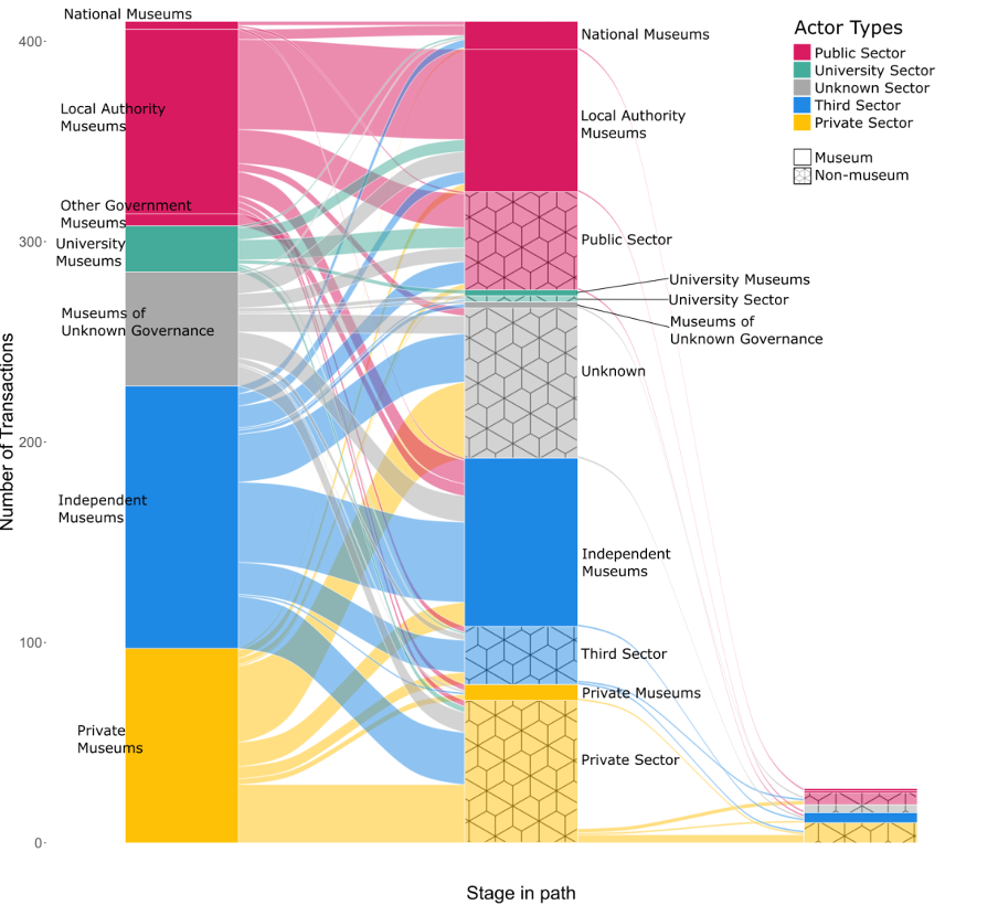
So far, so good. The problem now lay in how to better represent the quantities of objects flowing out of the closed museums, and that was a much more difficult issue because it concerned the precision and detail of the available data. In some cases, we knew that a museum’s entire collection was transferred to another institution. In the spreadsheet this is logged as a single transaction: when museum X closed, all the collection went to Y. In other cases – often transport museums – we had extremely detailed information about the individual items in a collection and where they went. We wanted to capture all the information we possibly could, so each itemised transaction is included in the spreadsheet. For instance, Clarke Hall Educational Museum made transfers to sixteen recipient organisations whereas the collection from Manor House Museum was moved wholesale to the Moyse Hall Museum in Suffolk. In Figure 4 the size of the coloured blocks in the bars and the width of the ribbons relate to the number of transactions, so the sixteen transactions from Clarke Hall occupy more visual space than the single transfer from the Manor House Museum, irrespective of the size of the collections. This was an unsatisfactory solution.
To complicate matters further, some of the information we received was far less specific. It was common for stakeholders to say things like ‘some of’ the collection went to a local museum, ‘a few things’ to the town hall and ‘everything else’ went to the school. These are clearly relative measures and depend on how big the collection was in the first place. ‘Most of’ one collection may be roughly equivalent to ‘a bit’ of another. And it is rare to be able to establish the size of a collection, even when the museum is open. How then were we to model the data we had received?
The project team devised a work-around. We estimated the relative size of transactions using the formula: (museum size x collection size), with museum size being the midpoint of the categories used in the original Mapping Museums research (small = 5,000; medium = 30,000, and large = 500,000 visitors per year) and collection size being quantified as (few = 5%; some = 25%; half = 50%; most = 80%; all = 100%). National and local authority museums tend to be larger and as you can see in Figure 5, transactions of collections starting in national or local authority museums tend to have thicker ribbons than those starting in independent museums.
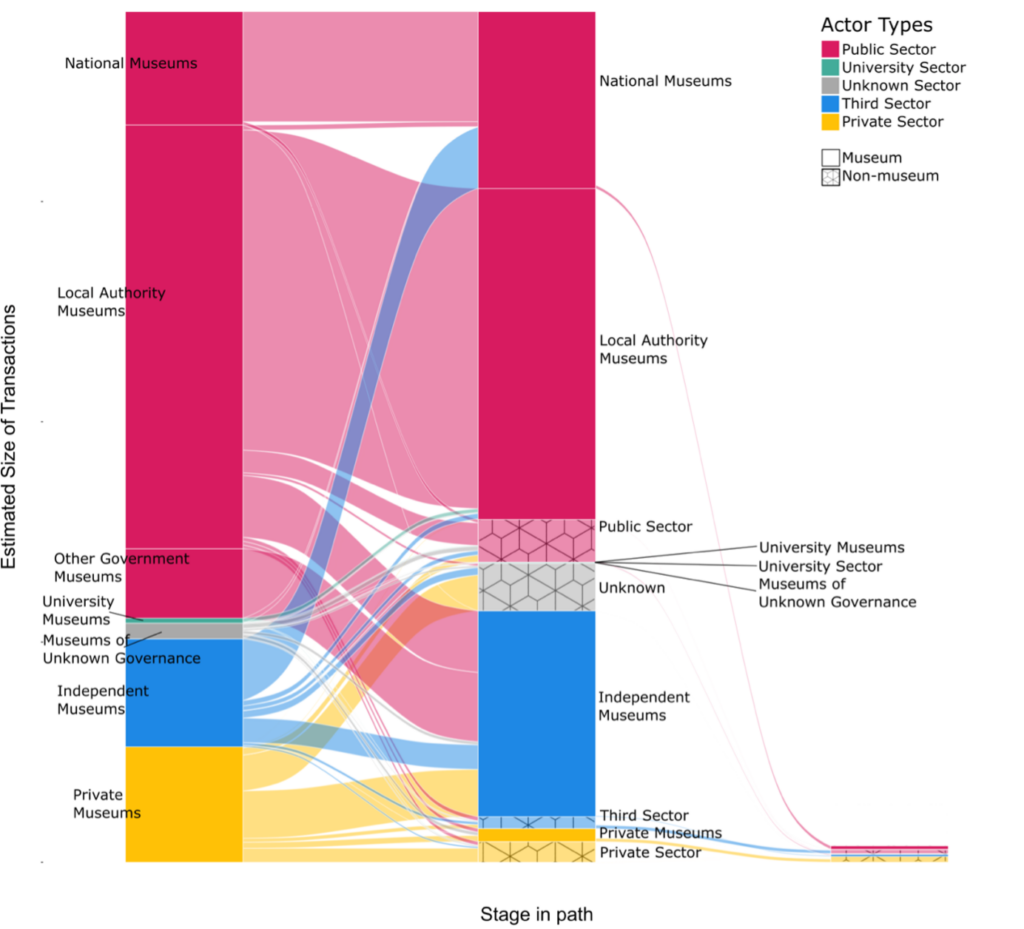
Figure 5 was an improvement, but there were still problems. Firstly, the figure gave no indication of how many museums were involved in these transactions and second, there was no way to visually convey the uncertainty of the data. Third, the alluvial diagram created visual continuity between very different entities: national museums, private museums, and airports all occupied the same neatly bounded space, implying connections or similarities which did not necessarily exist.
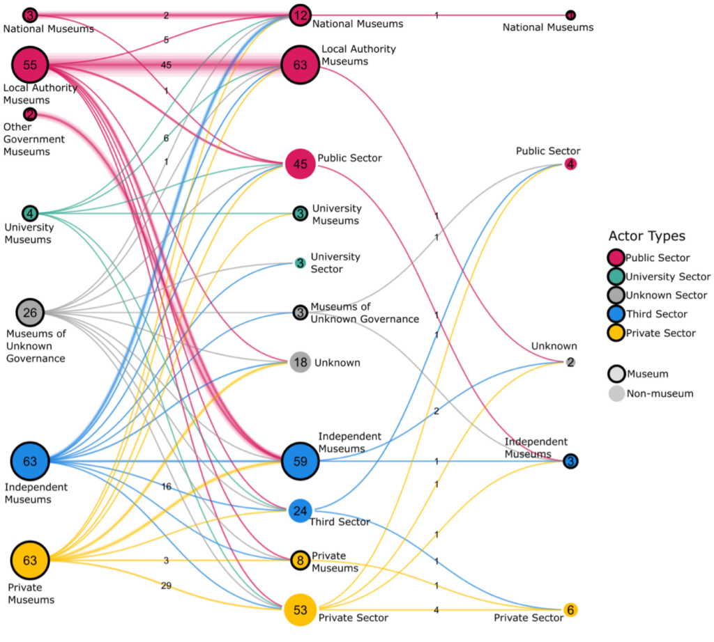
It was time to try a different tack, so we started experimenting with network diagrams. The lines represent flows of objects between actors and move from left to right. Closed museums are represented by circles on the left, recipient organisations in the middle, and any further destinations on the right. Using a network diagram helped solve the problem of visual continuity. It also enabled us to plot the number of museums involved and the size of the transactions and to register a degree of uncertainty: the size of the circles indicates the number of museums or recipients, while the line between is both labelled with actual numbers and uses an additional band to show the estimated sizes of those transactions. Using the network diagram, it became possible to make statements such as:
‘We know of 55 local authority museums which closed during this time. We know that there were 45 transfers of ownership from closed local authority museums to other local authority museums. We think that these transfers involved a relatively large quantity of objects’.
So far this seems to provide the best solution to modelling our data, but it is still work in progress and we welcome any comments.
Fiona Candlin and George Wright
November 2024