Are museums more likely to close in areas of higher deprivation? It seems an obvious question. The more deprived an area is, the less capacity the council has for raising revenue from business rates and council tax, and the more likely it is to have to cut non-statutory services, such as museums. Meanwhile independent museums in deprived areas might struggle due to the lack of disposable income. Except that turns out not to be the case.
In the last blog we considered closure according to region, which provided us with an overview of museum geography in the UK. In this blog we take a more granular approach and draw on the Index of Multiple Deprivation. This is the official measure of relative deprivation in the UK and is assessed on a combination of household income, employment, education, health, crime, barriers to housing and services, and living environment. Using the index allows us to look at deprivation in relation to small areas with around 1,500 residents apiece, which then enables a more nuanced understanding of where museums are located and the types of places where closure occurs. Deprivation is calculated differently in Northern Ireland, Scotland, and Wales, making comparisons difficult, so in this blog we focus only on England.
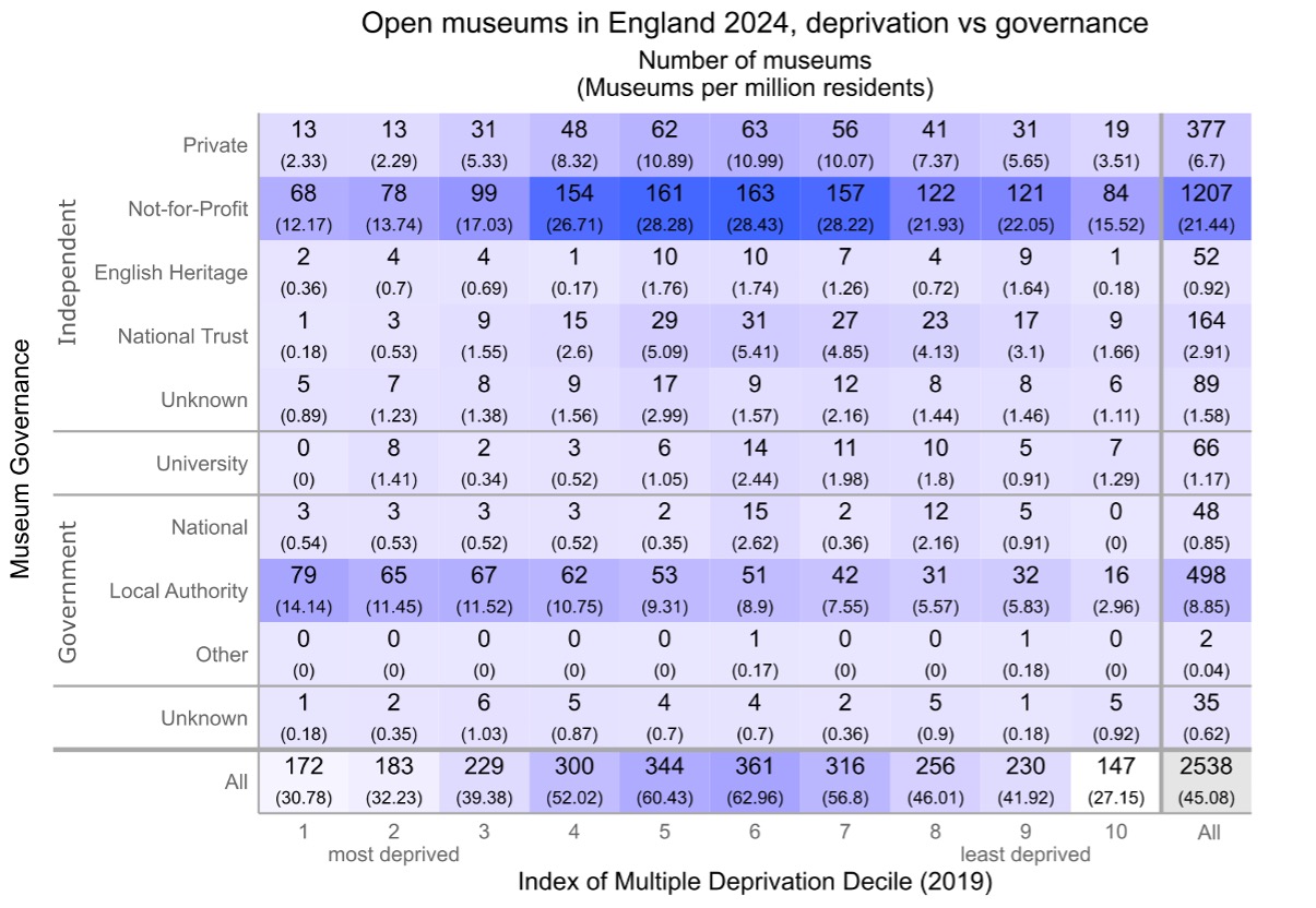
Table 1. Museums in 2024: deprivation vs governance. Darker blue indicates a larger number of museums (click to enlarge)
Table 1 shows the distribution of open museums across England as of the beginning of 2024. They have been classified according to governance and the deprivation of the ward in which they are located. As you can see, all kinds of museums can be found in almost all areas – irrespective of deprivation. There are no national museums in the least deprived areas and no university museums in the most deprived, although both these types of museums have relatively small numbers. Most notably, private, and independent (not for profit) museums cluster in the middle ground, while local authority museums tend towards the most deprived.
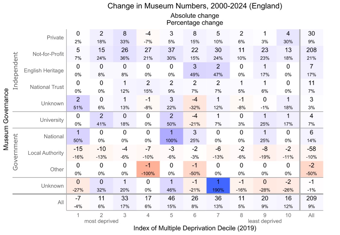
Table 2. Changes in museum numbers 2000–24: deprivation vs governance. Blue indicates growth in museum numbers, red indicates decline in museum numbers. Deeper colours indicate a larger percentage change. (click to enlarge)
Table 2 shows change in the number of museums since 2000 and gives the percentage change in each category. As we outlined in our previous blog the number of independent (not for profit) and private museums rose since 2000. Here we can see that the expansion in numbers of not-for-profit and private museum goes across the spectrum of deprivation with large growth in the middle.
The number of Local Authority museums has decreased since 2000 but there has been less decrease in the middle ground. There has been a greater decrease in the number of Local Authority museums at the edges of the spectrum, that is in areas of most and least deprivation.
There are two important caveats to this data. Firstly, the Index of Multiple Deprivation does not equate to average affluence or poverty. Rather it looks at most and least deprived, which is slightly different. So for instance, one area may contain pockets of extreme wealth and considerable deprivation, whereas another may be less affluent but also have little deprivation in the sense that residents are all in employment, there are low rates of crime, and so on. According to the Index the first area is more deprived – there is some deprivation amid the wealth – while the second is less deprived.
The second caveat is that a museum’s location is not synonymous to the visitor catchment area. These small areas represent the immediate geographic context in which a museum is sited and visitors may come from much further afield. The degree to which they do so depends in part on the type of museum in question; whether it is a national, regional, or small local museum. Going forward we will be thinking further about calculating the distribution of museums and change according to the visitor catchment area.
Yet despite the caveats, the data shows that change in the sector does not neatly align with levels of deprivation. We cannot link museum closure to deprivation or indeed growth in numbers to a lack of deprivation.
Map of museums growth UK 1960-2017 by Andrea Ballatore
Until fairly recently, I had no idea that organising museums according to their location could be quite so complicated. In the original proposal for the Mapping Museums project, we had stated that we would develop a database that would enable researchers to search our data according to a museum’s location and to visualise that information. For instance, a user could browse through all the museums in Yorkshire or see them marked as points on a map. That seemed reasonably simple. Why, then, did this task keep me awake at night?
I now know that there were three key questions and areas of research, but initially, they blurred into one confusing mass. We needed to decide which boundaries we would use, how the database would be organised with respect to location, and to identify the datasets that would underpin the database and create map-based visualisations. We also had to think about the needs of different users. This blog looks back on why we initially struggled with location and the decisions we made about how to map our data.
Choosing boundaries
The first task was deciding which boundaries we should use to search and map the museums listed in our dataset. The Museum Development Network and Arts Council use regions as the basis for organising support and funding. The Office of National Statistics also uses them in statistical analysis, and so my first thought was to follow that structure. I quickly found information on the nine regions of England and then looked for data on Northern Ireland, Scotland, and Wales, only to discover that for analytical purposes, those three countries are considered to be equivalent to regions. Putting Scotland or Wales on a par with the East of England or the West Midlands seemed to imply that these countries had the same status as a sub-section of England, and hence were insignificant in relation to England as a whole, which was problematic.
Our next approach was to organise our data according to counties. I then discovered that there are various different types of county: historic counties have their origins in the Middle Ages and still form the basis of many contemporary boundaries; ceremonial counties, which are also referred to as the geographic counties, and which are overseen by a Lord Lieutenant; and the administrative counties, which were replaced by metropolitan and shire counties. Given that we are likely to consider the allocation of financial and other resources, it seemed sensible to use the boundaries that relate to Local Authority administration, and so the Mapping Museums Computer Science researcher started to build the map according to metropolitan and shire counties. Unfortunately, when he presented his work, the image had large gaps with no information. It took me some time to work out that, even though counties are commonly referred to in each country, for administrative purposes, Wales is divided into unitary authorities, Scotland’s sub-divisions are known as council districts, and Northern Ireland has local government districts. Thus, these areas did not show up on a map that referenced counties.
The situation becomes even more complicated within England, which is divided into metropolitan and shire counties, and unitary authorities. Greater London is its own entity and does not belong to any of the other groups. Each of those categories then further sub-divides. Whereas the administrative units in Northern Ireland, Scotland, and Wales have only a single tier, England has a more complex hierarchy. Metropolitan counties divide into metropolitan districts, shire counties divide into non-metropolitan districts, and Greater London into London Boroughs. Unitary Authorities do not have sub-divisions at this level. Table 1 makes this organisation clear.
Table 1: Administrative organisation of the UK
The local authority units are differently constituted in the four countries. However, to make the situation more complicated there are different kinds of administrative geographies. Depending on the public service (census, health, postal, electoral, etc.), the territory of the UK is sliced up in different ways, as displayed in Figure 1.
Figure 1: Hierarchical representation of UK statistical geographies
For the purpose of analysis, some geographical entities like counties are widely used by British people to cognise the territory of the UK, but do not cover the entire space, leaving areas with museums unreferenced. Ideally, a useful organisation of the geographic space in this context must meet three criteria:
All territory should be covered
Units should not overlap
Units should be homogenous in terms of a target attribute (size of the resident population or something else).
UK geographies like the Output Areas or the Local Authority Districts are designed to meet these criteria and are therefore suitable for statistical analysis (less so for spatial cognition). Interestingly, the European framework NUTS aims precisely at creating some order in the messy administrative geographies of EU member states, providing a useful way to think about their commonalities and differences across countries, many of which have similarly intricate administrative geographies (while allowing interoperability and harmonisation of statistical data across different countries).
Choosing the appropriate geography for this project was therefore far from a trivial problem, and the most flexible approach consists of supporting multiple frameworks. Our solution was to identify the location of the museum as precisely as possible in terms of latitude/longitude, so that this location can then be used to assign the museum to any geographic unit., supporting different types of aggregation and analysis.
Organising ‘location’ in the database
The heterogeneous and asymmetric structure of the UK’s administrative geography also had implications for how we designed the database. We had originally intended that the search or browse facility for location would be arranged as a hierarchy of descending size or administrative importance. Following my investigations in administrative borders, I realised that there was no consistent hierarchy, and each country needed its own location logic to be defined. How then to proceed?
Throughout the research, the project co-investigator Professor Alexandra Poulovassilis has adamantly argued that we should not simplify complex data when designing the database. The search and browse functions should be able to encompass and manage some of the messiness of organisation in the real world. Accordingly, our menu of location was organised according to the separate hierarchies of the country in question. A drop-down menu shows England, Northern Ireland, Scotland, Wales, Channel Islands and Isle of Man (the latter two entities are Crown Dependencies rather than part of England). Clicking on Northern Ireland, Scotland, Wales shows their district councils, councils, or unitary authorities as appropriate. England subdivides into regions, then into a mixture of unitary authorities, counties and metropolitan counties, with the latter having the further sub-categories of districts. The region of London divides into the City of London and boroughs. Even though it is not symmetrical, this layout has the advantage of using recognisable sub-divisions, and of acknowledging the differences between the administrative geography of each country.
Identifying datasets
Having decided to use an administrative geography and having agreed that we would not attempt to simplify the differences between the four countries, we then needed to find datasets that would facilitate the organisation of our data. Once again, this involved something of a learning curve and I now know that two types of datasets are required. The first correlates administrative boundaries with postcodes (which we’d collected for each museum) and thus links each museum to a district, council area or region as required. The second dataset enables that information to be visualised in the form of a map.
Datasets that contain the coding for administrative boundaries and their visualisations are devised and available from several organisations, most notably the National Offices of Statistics. However, data collection and analysis within the UK is complicated by devolution. In some cases, the datasets cover two countries or even all four, but generally, the datasets relate to the individual countries of England, Ireland, Scotland and Wales, and to use non-computing terminology, these need stitching together.
A further issue arose in that we needed to find a way to map our data, but we also wanted to import other kinds of data to inform our findings, For instance, we planned on importing census data and using that to make links between museums and the geo-demographic contexts in which they were founded. This meant that we had to choose datasets for locations that would be compatible with any datasets that we may use in the future. In short, we needed to know if we would import additional data in the future, and if so what. It was at this point that we realised we needed expert help and were fortunate enough to have Dr Andrea Ballatore a specialist in geographic information science join the team. He advised on how the different datasets could be combined and also recommended that we use the same administrative framework as the Office of National Statistics as this would allow us to cross-reference our data. Since then the process of mapping museums has proceeded much more smoothly.
Administrative and ordinary geographies
The problem of using current administrative geographies is that they are not always in common usage. For instance, I had not previously encountered English unitary authorities and would never think to look for ‘Liverpool City Region’ when I could look for ‘Merseyside’. The database had to support analysis (i.e. link museums to the correct administrative unit in order to generate accurate statistics) and thus we had to use the relevant geographies, but it also had to support spatial cognition (i.e. help users understand where a museum is using their prior knowledge of the UK). Our solution was to introduce a TownorCity field in the search pages. Users could thereby search by administrative area or on a more intuitive basis by towns or cities.